Cracker Barrel CEO praises company's 'Google star rating' while revealing huge financial losses
Cracker Barrel just had its quarterly earnings meeting, during which the CEO admitted she does not have "a crystal ball."
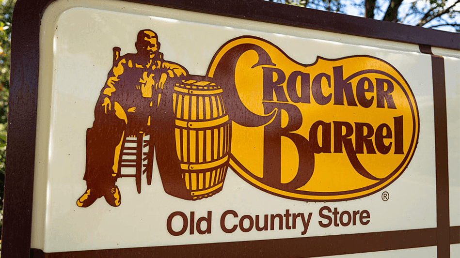
Sales have decreased since the 2025 logo and branding change that saw Cracker Barrel deliver the biggest marketing blunder of the year. The shift was so bad that the new branding became a national story, and the board member who pushed for it soon resigned.
'We know we are headed in the right direction.'
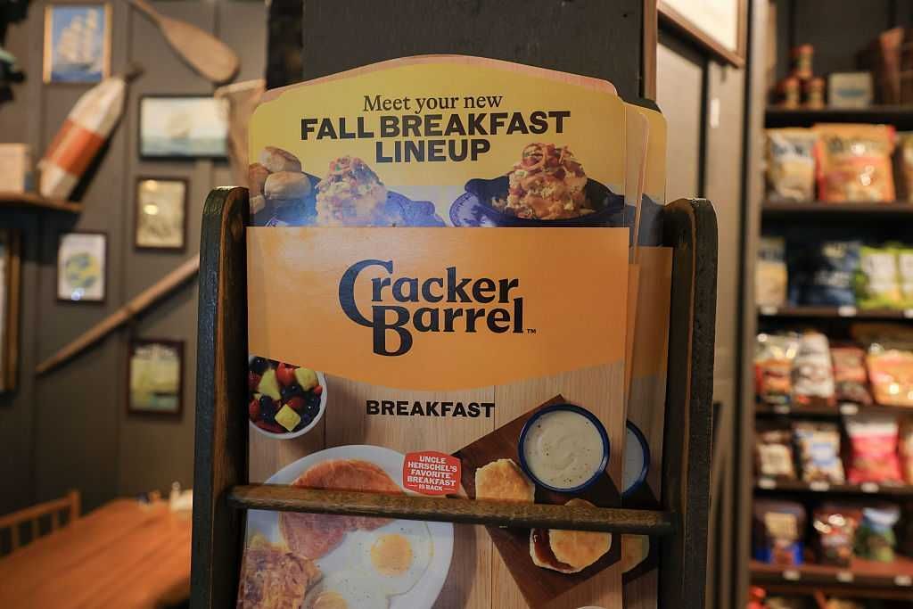
Still looking to recover from the disaster, Cracker Barrel put out its second quarter fiscal report for 2026 on Wednesday, and the report showed significant losses for a company of its size.
Total revenue took a hit, decreasing by 7.9% compared to the year before. Restaurant revenue dropped by 7.5%, with management explaining that traffic had declined by more than 10%.
In the earnings call, CEO Julie Masino — who was at the helm when the new store design failed — boasted to investors about the restaurant's Google review rating, one of the few highlights.
"Our Google star rating, which over the long run is strongly correlated with traffic, was 4.28 in Q2," Masino stated, noting that it was a six-year high. "This represents the highest quarterly score since Q2 in fiscal year 2020."
While Masino said, "I do not have a crystal ball," and that she does not have a "correlation that says when scores improve by X, traffic follows," she was confident that the company's "indicators" still correlate to "growth and improvement."
In addition to the Google reviews, Masino cited increased guest satisfaction scores, lower manager turnover, improved traffic within the quarter, and a "meaningful percentage" of guests returning who did not visit in previous quarters.
"We know we are headed in the right direction, and everybody is working hard to make that a reality," Masino added.
The CEO also boasted about the restaurant's business during Thanksgiving week 2025, which she called "a big week for us."
However, despite bringing in $110 million in sales, which represents between 12% and 13% of total revenue for the quarter, "Thanksgiving traffic was in line with the rest of the month, so it did not crazily outperform or anything like that," Masino admitted.
"Our disciplined focus on operational excellence is driving significant improvements in several key guest metrics, many of which serve as important leading traffic indicators," Masino said in the company's press release. "We have also taken additional actions to improve financial performance and remain confident that we are well-positioned to regain prior momentum."
In the end, the board of directors still declared a quarterly dividend of $0.25 per share, and the company is still expanding ever so slightly with the opening of two new stores.
Like Blaze News? Bypass the censors, sign up for our newsletters, and get stories like this direct to your inbox. Sign up here!
 From winners like J.D. Vance and DOGE to losers like Jake Tapper and (also) DOGE, here are The Federalist Staff's picks for 2025.
 It would be foolish to assume the aesthetics we surround ourselves with have no effect on how we perceive the world.
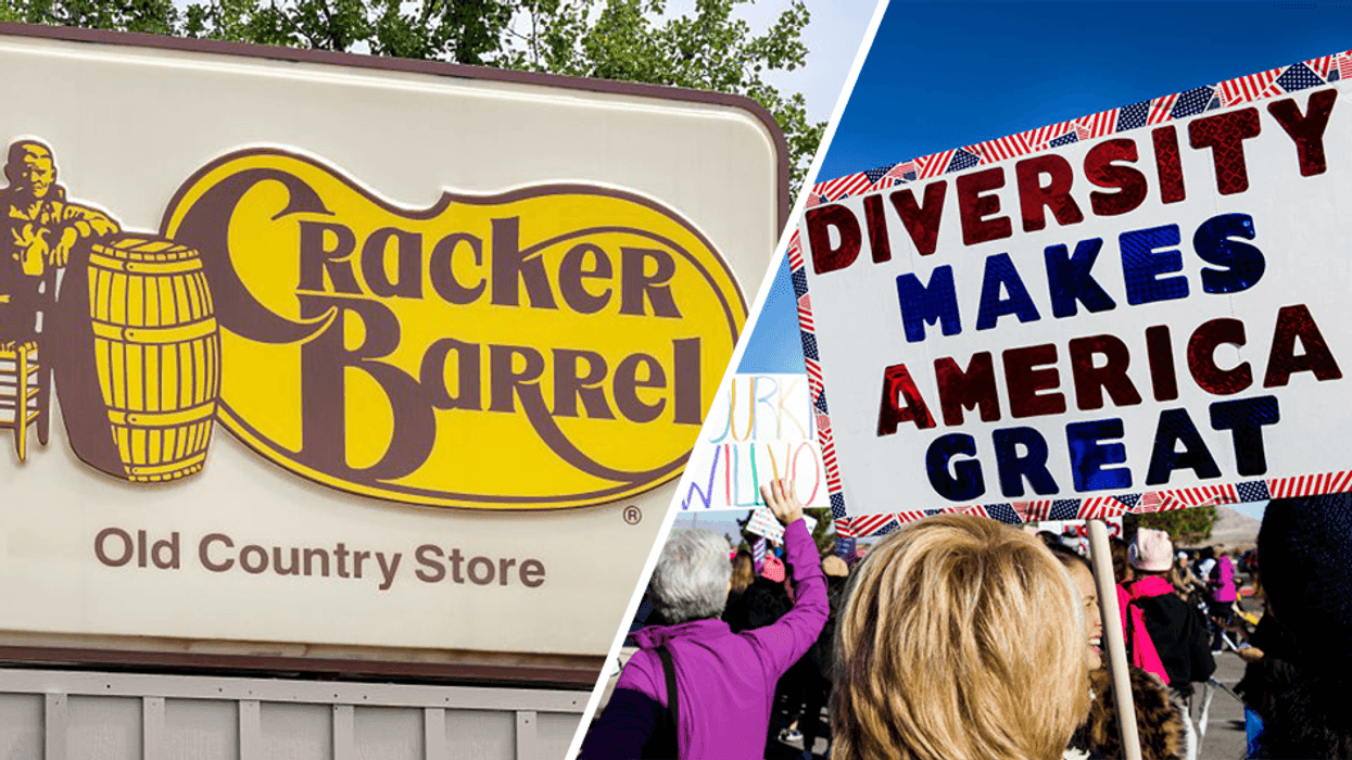
 Photo by Andrew Harnik/Getty Images
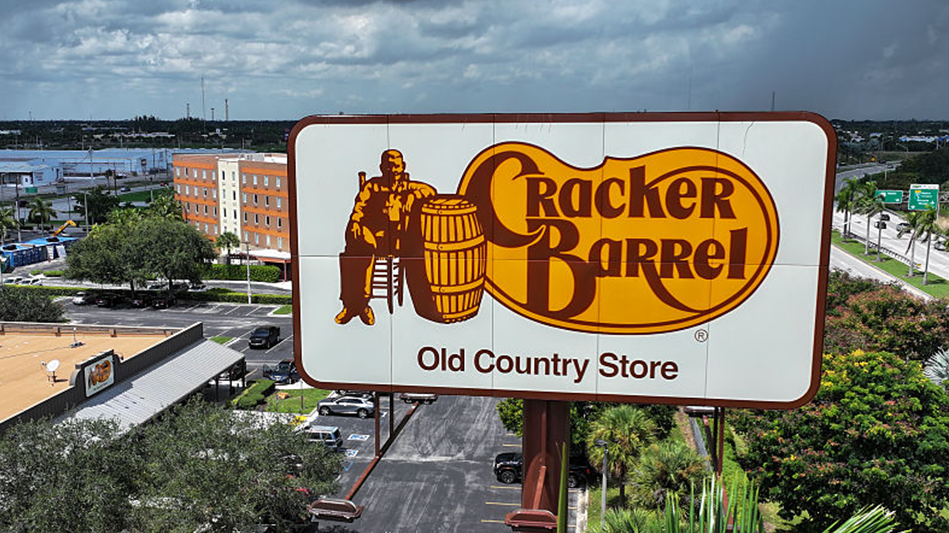
 Photo by Paul Weaver/SOPA Images/LightRocket via Getty Images
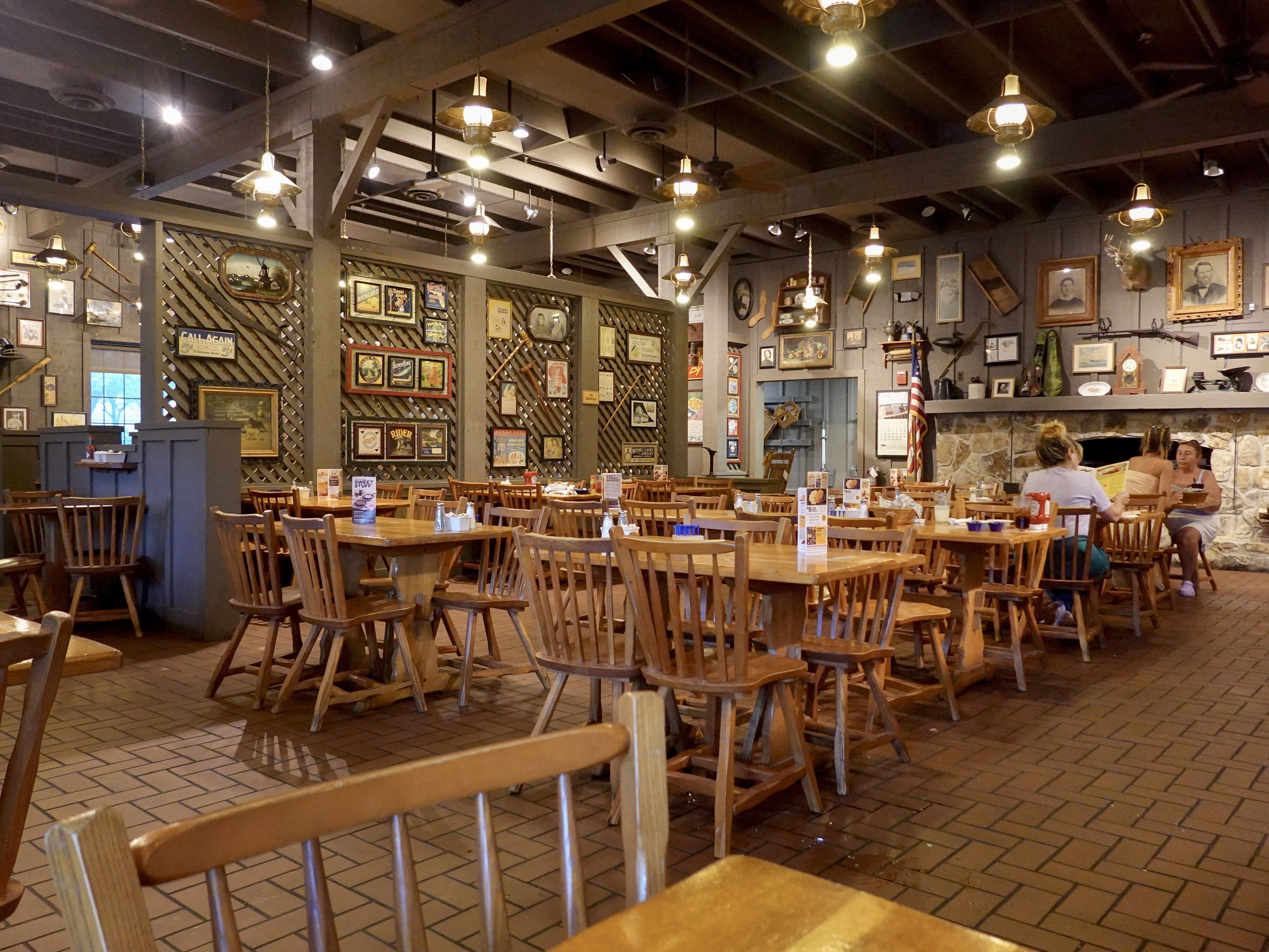
 Photo by Bloomberg / Contributor via Getty Images
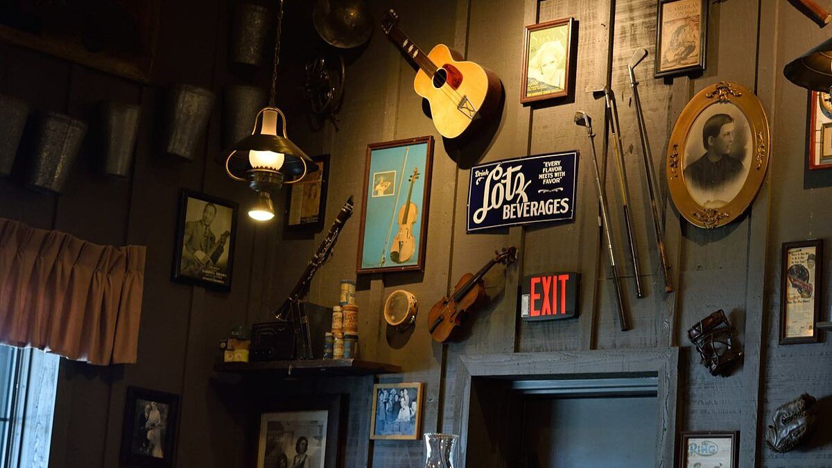 Conservatives hold more cultural power than they may realize. The question is: Will they continue to use it? Weeks after abandoning its plans to ax the infamous Uncle Herschel from its iconic logo, the southern restaurant chain Cracker Barrel announced Tuesday that it is not moving forward with the sterile redesign of its dining rooms […]
FACT CHECK: Did Dan Goldman Call for Trump’s ‘Elimination’ After a 2024 Assassination Attempt?