Carnival cruise ship hammered by party-crashing winds and gargantuan waves


A cruise liner completing its journey from the Bahamas to Charleston, South Carolina, was battered in its final stretch Friday by a powerful storm, which left glass shattered, hallways flooded, and some passengers praying for relief.

The gargantuan waves and strong winds that rocked the Carnival Sunshine, a 102,853-ton ship with a guest capacity of over 3,000 souls, were resultant of a low-pressure storm system that hit the East Coast over the weekend.

Daniel Taylor, a passenger aboard the vessel, told the Daily Mail that around 4:30 p.m. on Friday, the ship sailed into choppy waters, prompting the captain to both issue an advisory about adverse weather conditions and warn of a possible delay.

"He said that the staff would do everything they could to minimize discomfort," said Taylor. "I went to a show in the Liquid Lounge at the front of the ship at that time. ... The sound of us crashing into the swells could be heard over the music playing."

Taylor's intended distraction at the lounge served only to highlight the intensity of the storm.

"Stage lights mounted on the ceiling began to shake, the disco ball started swinging, and the LED wall on the stage ... began rolling side by side on its own," added Taylor.

Sharon Tutrone, a professor at Coastal Carolina University who was a passenger on the battered ship, noted on Twitter that the Sunshine spent "11 hours pitching, diving, and rolling," all the while surrounded by lightning.

Tutrone added that at one point, "the ship took a huge hit by a wave and sounded like it split in two."

The situation reportedly continued to deteriorate into the night, with only sporadic updates from the crew as water began pouring from the ceilings and into the hallways.

WCIV reported that passenger Christa Seifert-alicea said the silence from crew members amid the dark and rocking was the "worst part."

"What we endured is indescribable, not only to feel it yourself but to hear and see it set in on every single person around you from adult, child, and the elderly is something I will never forget," said Seifert-alicea.

Videos shared online by various passengers show the ominous weather that delayed the ship's return as well as the damage wrought within the vessel.

\u201cFootage from the Carnival sunshine cruise \ud83d\ude33\ud83c\udf0a Video credit: \ud83d\udcf9 TT: k8lyns_m\u201d
— Wow Terrifying (@Wow Terrifying) 1685403445


The Daily Mail reported that minor injuries were sustained and one person aboard indicated, "You could smell people being sick walking down the halls."

Vomit ejected by the panic-stricken was not the only thing racing down the halls during the ship's Odyssean thrashing.

One video of a lower deck shows debris, broken doors, and waste traveling down one hallway on a surge of water:

\u201cThe aftermath aboard Carnival Sunshine after a severe storm. \nThe crew from Deck 0-4 evacuated to the theater, and anywhere they could rest\u2026 the crew bar destroyed.\u201d
— Crew Center (@Crew Center) 1685268922


Passenger Brenda Shobert wrote on Facebook, "We had a 40 foot wave hit our side of the ship,.. we almost fell out the bed.. things were crashing all around us and the carpet on my side of the bed was soaked bc water came in thru our balcony door."

The cruise line said in a statement to Fox Weather, "Carnival Sunshine’s return to Charleston was impacted by the weather and rough seas on Saturday. The weather’s prolonged impact on the Charleston area delayed the ship’s arrival on Sunday and as a result, the next voyage’s embarkation was also delayed. We appreciate the patience and understanding of all our guests."

Carnival added, "The weather and rough surf led to some crew cabins being temporarily taken out of service while we clean up water damage. All the public areas of the ship are open and in service and Carnival Sunshine is currently operating its next cruise, a five-day Bahamas sailing."

\u201c@CarnivalCruise #carnivalsunshine The morning after the storm. 9:07am.\u201d
— FlyersCaptain\u2122\u00ae\u00a9 (@FlyersCaptain\u2122\u00ae\u00a9) 1685319945

Like Blaze News? Bypass the censors, sign up for our newsletters, and get stories like this direct to your inbox. Sign up here!
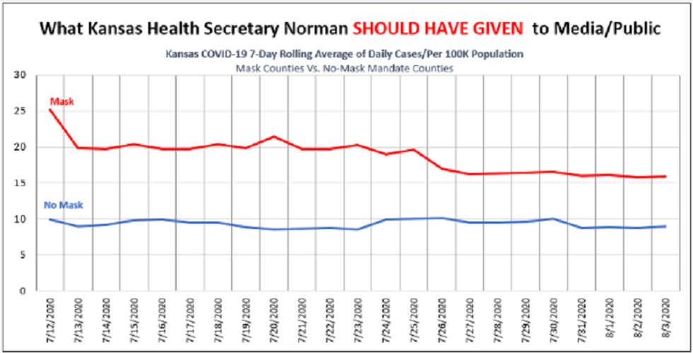
Horowitz: Kansas health officials present manipulated, deceptive chart to mislead public about mask effectiveness

Whether it’s forcing people to wear a mask on a Zoom call, while at home, or while having marital relations, wearing a mask is the new cult. No evidence is needed to force it upon us, and the more the virus spreads in areas that already mandated masks, the more they double down on their faith in the cloth. As such, it was only a matter of time before they fabricated evidence of its effectiveness. After all, they can’t produce any unfabricated evidence.

On August 5, Kansas Department of Health Secretary Lee Norman tried to prove through a visual aid that the Kansas counties that followed the governor’s mask mandate had fewer COVID-19 cases than the no-mask counties. Thanks to the Republican-dominated legislature, 90 out of Kansas’ 105 counties were able to opt out of Democrat Governor Laura Kelly’s mask mandate. Naturally, it was reasonable for Secretary Norman to try to ascertain which counties did better. What wasn’t natural, however, was the manipulated chart he used to show the media that the mask counties did better, when in fact the opposite was true.

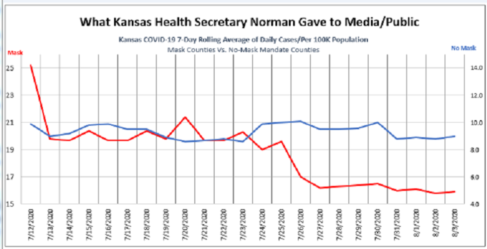
During the media briefing, Norman displayed the following chart on an easel. (This graphic has an added title line, "What Kansas Health Secretary Norman Gave to Media/Public.")

To the average person, the chart seems to clearly show the cases in mask counties, which are represented by the red line, plummeting from about 25 cases per 100K a day on July 12 to about 5 cases a day in early August. At the same time, the non-mask counties represented in blue appear flat and to land at about 9 per 100K in early August, clearly higher than the mask counties.

As KAKE reported, Michael Austin of the Kansas Policy Institute noticed something was off. He knew from the raw data that the non-mask counties had a lower case rate. Then he realized that this graphic was using two different x-axis lines in the same graph for the two categories. This explains why the chart depicts an impossible flat blue line for non-mask counties even though it appears to go down from 21 to 9. In fact, the cases for mask counties in red are based on the left axis, with a scale of 15 to 25, while those without mandates are based on a secondary axis on the right, with a scale of 4 to 14.

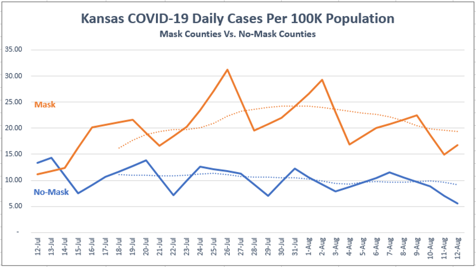
What does the chart look like if you actually placed them on the same axis to reflect the authentic case per capita data, as any honest person would do? Here is the chart Michael Austin sent me:

As you can see, while the mask counties did go down from about 25 to 15, they always remained higher to this day than the non-mask counties, which have flatlined at about 9-10 cases per 100K. In other words, those counties with mandates have about 77% more cases per capita per day than those without the mandate, yet the health secretary sought to depict the opposite.

It’s not that Norman was just trying to show that mask counties had a relatively larger drop in cases. He was actually suggesting that mask counties had a lower rate at present in absolute numbers. At the 15-minute mark of the recording, a reporter asked if he believes that non-mask counties would be able to drop below the mask counties if they began wearing masks like good subjects. Norman replied, “I think it would.” The problem is they are already below the mask county levels! They always had a flattened curve and never needed to flatten it.

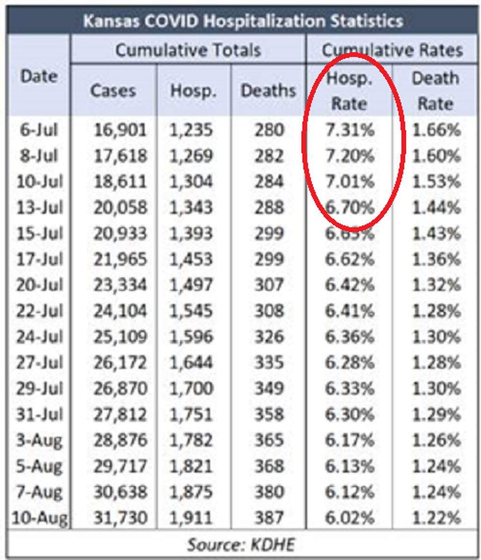
One might suggest that even though Secretary Norman was wrong about the rate of cases in mask counties dipping below those of non-mask counties, it still dropped at a relatively sharper pace than in non-mask counties. The problem with this analysis is that the rate of hospitalization was already dropping at least a week earlier in early July.

This was the story in every state that got hit earlier and then had another mild wave in June. It mainly hit the highly dense urban areas, the virus raged for about six weeks regardless of public policy, and then it started to decline. Whereas most rural, low-population-density counties around the country simply always had a low, flat curve, rather than a sharp peak. All of the non-mask counties are rural counties, but the largest urban areas, such as the greater Kansas City metro, Lawrence, Wichita, and Topeka, were all in counties that did not opt out of the governor’s mask mandate.

As you can see below, the non-mask counties had roughly the same curve timing as the mask states, they peaked at the same time, and went down at the same time. The only difference is that the incline among the non-mask counties to begin with was lower, so naturally the decline is going to be milder. Isn’t that the flat curve we were trying to achieve?

Thus, as we see today with the late-hit states in southern latitudes like Hawaii, the mandates in place for months didn’t help prevent their peak in cases, and the states that got hit earlier before masking became cool began to decline before the mandate was in place. The virus does what the virus does.

Moreover, the non-mask counties actually did much better per capita than any of the data suggest because they have the anomaly of dealing with the meat-packing plants, one of the most vulnerable places for transmission in the country. Typically, rural counties have far fewer cases per capita than urban counties. However, Kansas has many agricultural processing interests with vulnerable facilities as well as vulnerable populations that have tested positive.

This is reflected in the astounding fact that 41 percent of all cases in Kansas where ethnicity has been confirmed are among Hispanics, even though they are just 11 percent of the state’s population. Their case rate per capita is nearly six times that of non-Hispanics. This is clearly driven by the agricultural facilities.

Then again, you can’t blame liberals for trying to manipulate data to demonstrate the effectiveness of their new religious symbol. As Swedish epidemiologist Anders Tegnell said, scientific evidence for mask-wearing to prevent COVID-19 is “astonishingly weak,” and it is “very dangerous” to believe that face masks on their own could control the spread of the disease. And he would know. His country has now achieved in real life what the Kansas health secretary chose to fabricate on a chart, all without mandating masks.


Horowitz: Bombshell study: Could half the uninfected population already be partially immune?

Could nearly half the population not already infected with SARS-CoV-2 be immune to it from having already contracted other forms of coronavirus in recent years?

That is one implication of a major study conducted by over a dozen researchers from several microbiology and immunology institutions in the U.S.

The purveyors of panic are warning of a second wave of the virus and that even if we are correct in asserting that the general fatality rate is extremely low for most people, it will still result in millions of deaths worldwide if we need 70 percent of the population to get the virus in order to achieve herd immunity. Putting aside the fact that their strategy of lockdown doesn’t provide a solution to this hypothetical problem either, even as it kills more people from the collateral damage, there is now promising evidence that more people might already be immune to the virus.

The study is built upon the principle that T cells play a central role in destroying viruses and providing immunity. Not only were these cells discovered in all the blood samples of confirmed recovered COVID-19 patients, but they were also found in 6 of the 11 blood samples from 2015-2018, before those individual donors could possibly have contracted the virus.

Until now, the assumption was that only those with IgG or IgM antibodies can be immune because they are the ones who have already contracted the disease. However, this study examined the cellular defenses that are created in the body and have been proven to serve as a defense against SARS-CoV-2, then discovered them among 40%-60% of their samples not infected with SARS-CoV-2.

In order to prove the efficacy of these T cells developed in the recovered population, the researchers exposed immune cells from 10 recovered patients to the virus. They found those cells effectively fight the virus. 100% of the samples of 20 donors contained “helper” T cells, known as CD4+, and 70 percent contained killer T cells, known as CD8+, which directly kill the viral cells. Then they discovered “SARS-CoV-2−reactive CD4+ T cells in ∼40-60% of unexposed individuals, suggesting cross-reactive T cell recognition between circulating ‘common cold’ coronaviruses and SARS-CoV-2."

The hypothesis is that numerous common colds are forms of coronavirus and that a significant percentage of the population that has already contracted those forms of coronavirus have cross-immunity to COVID-19. It’s unclear to what degree these people are immune, but it might help explain why some people in certain areas react so violently to COVID-19, whereas so many others are asymptomatic. In other words, it's possible that people with cross-immunity could still catch the virus, but their reaction to it will either never present symptoms or present very mildly due to the pre-existing T cells working for them.

The authors note that more time and cell numbers are needed to study identification of the cross-reactive chains of cells.

A similar T cell study published April 22 by German immunologist Andreas Thiel found that 34% of 68 blood samples from people not infected with SARS-CoV-2 hosted helper T cells that nevertheless recognized the novel coronavirus.

The authors of the newer study posit that the concept of “crossreactive memory T cell responses might have been one factor contributing to the lesser severity of the H1N1 flu pandemic.” There is still no way of proving whether those T cells discovered in non-infected individuals are definitively effective in warding off the virus or blunting its symptoms, but the theory might explain some enigmatic behaviors of this virus.

On the one hand, this virus seems to be extremely contagious and transmissible. On the other hand, it appears to have been around for a while, possibly in December, and didn’t kill too many people until super-spreading events in March.

On the one hand, the virus seems to kill a lot of vulnerable people for several weeks. But then it peaks after six weeks or so and nearly disappears a month or so later. We’ve seen the same curve in every country, almost as if it hits a brick wall and then runs out of steam.

But why is that the case? Most antibody tests show no more than 10%-15% of the population contain antibodies in a given area – 25% in the most extreme case of New York City. Why would the virus not continue cutting through the population like butter, as it did the first number of people who contracted the virus? The theory of a more ubiquitous cross-immunity from other coronaviruses would answer those questions and explain that invisible brick wall.

A theory of partial immunity, at least from helper T cells (if not killer T cells) could also explain why, on the one hand, once the virus gets into prisons, most test positive for it, but on the other hand, nearly all of them seem asymptomatic. The outcome of prisons as a fully confined and defined population could be a harbinger of what would theoretically happen if the entire world were exposed to the virus after it had already targeted the most vulnerable population. It’s possible that upwards of 95% would be asymptomatic, just like we are seeing in prisons.

Perhaps, it could also explain why there appears to be a massive gap in severity of the virus in Asia vs. Western countries. Asian countries are regularly exposed to coronaviruses.

Professor Karol Sikora, founder of University of Buckingham Medical Schools, has a short video explaining in layman’s terms the significance of this T cell study and cross-immunity.

Sunetra Gupta, professor of theoretical epidemiology at the University of Oxford, is also a strong believer in the likelihood of cross-immunity. “We may also be able to fend off the virus with pre-existing responses against other coronaviruses, which I think is very likely to play a role in protection, specifically against severity of the disease,” said Professor Gupta in a recent interview with a British media outlet.

“In almost every context we’ve seen the epidemic grow, turn around and die away — almost like clockwork. Different countries have had different lockdown policies, and yet what we’ve observed is almost a uniform pattern of behavior which is highly consistent with the SIR model. To me that suggests that much of the driving force here was due to the build-up of immunity.”

Stanford professor of epidemiology John P.A. Ioannidis has also posited the existence of cross-immunity and the idea that many people’s bodies are using innate cellular immunity to ward off the virus.

This theory might also explain why Sweden believes it reached herd immunity with just 20 percent infected and why some studies suggest a similar ratio could be achieved elsewhere.

To be clear, these are all unproven theories at this point. But if our government and media were willing to run with unproven theories of doom and gloom even as the facts on the ground refuted them, shouldn’t they at least examine some good news when the fact pattern of the virus itself seems to harmonize with the theory?

Why are American politicians immune to good news as if it were the plague?

Horowitz: The CDC confirms remarkably low coronavirus death rate. Where is the media?

Most people are more likely to wind up six feet under because of almost anything else under the sun other than COVID-19.

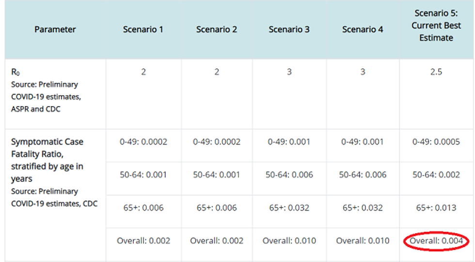
The CDC just came out with a report that should be earth-shattering to the narrative of the political class, yet it will go into the thick pile of vital data and information about the virus that is not getting out to the public. For the first time, the CDC has attempted to offer a real estimate of the overall death rate for COVID-19, and under its most likely scenario, the number is 0.26%. Officials estimate a 0.4% fatality rate among those who are symptomatic and project a 35% rate of asymptomatic cases among those infected, which drops the overall infection fatality rate (IFR) to just 0.26% — almost exactly where Stanford researchers pegged it a month ago.

Until now, we have been ridiculed for thinking the death rate was that low, as opposed to the 3.4% estimate of the World Health Organization, which helped drive the panic and the lockdowns. Now the CDC is agreeing to the lower rate in plain ink.

Plus, ultimately we might find out that the IFR is even lower because numerous studies and hard counts of confined populations have shown a much higher percentage of asymptomatic cases. Simply adjusting for a 50% asymptomatic rate would drop their fatality rate to 0.2% – exactly the rate of fatality Dr. John Ionnidis of Stanford University projected.

More importantly, as I mentioned before, the overall death rate is meaningless because the numbers are so lopsided. Given that at least half of the deaths were in nursing homes, a back-of-the-envelope estimate would show that the infection fatality rate for non-nursing home residents would only be 0.1% or 1 in 1,000. And that includes people of all ages and all health statuses outside of nursing homes. Since nearly all of the deaths are those with comorbidities.

The CDC estimates the death rate from COVID-19 for those under 50 is 1 in 5,000 for those with symptoms, which would be 1 in 6,725 overall, but again, almost all those who die have specific comorbidities or underlying conditions. Those without them are more likely to die in a car accident. And schoolchildren, whose lives, mental health, and education we are destroying, are more likely to get struck by lightning.

To put this in perspective, one Twitter commentator juxtaposed the age-separated infection fatality rates in Spain to the average yearly probability of dying of anything for the same age groups, based on data from the Social Security Administration. He used Spain because we don’t have a detailed infection fatality rate estimate for each age group from any survey in the U.S. However, we know that Spain fared worse than almost every other country. This data is actually working with a top-line IFR of 1%, roughly four times what the CDC estimates for the U.S., so if anything, the corresponding numbers for the U.S. will be lower.

As you can see, even in Spain, the death rates from COVID-19 for younger people are very low and are well below the annual death rate for any age group in a given year. For children, despite their young age, they are 10-30 times more likely to die from other causes in any given year.

While obviously yearly death rates factor in myriad of causes of death and COVID-19 is just one virus, it still provides much-needed perspective to a public policy response that is completely divorced from the risk for all but the oldest and sickest people in the country.

Also, keep in mind, these numbers represent your chance of dying once you have already contracted the virus, aka the infection fatality rate. Once you couple the chance of contracting the virus in the first place together with the chance of dying from it, many younger people have a higher chance of dying from a lightning strike.

Four infectious disease doctors in Canada estimate that the individual rate of death from COVID-19 for people under 65 years of age is six per million people, or 0.0006 per cent – 1 in 166,666, which is “roughly equivalent to the risk of dying from a motor vehicle accident during the same time period.” These numbers are for Canada, which did have fewer deaths per capita than the U.S.; however, if you take New York City and its surrounding counties out of the equation, the two countries are pretty much the same. Also, remember, so much of the death is associated with the suicidal political decisions of certain states and countries to place COVID-19 patients in nursing homes. An astounding 62 percent of all COVID-19 deaths were in the six states confirmed to have done this, even though they only compose 18 percent of the national population.

We destroyed our entire country and suspended democracy all for a lie, and these people perpetrated the unscientific degree of panic. Will they ever admit the grave consequences of their error?